Trap of simplicity vs excuse of complexity - Enterprise app design
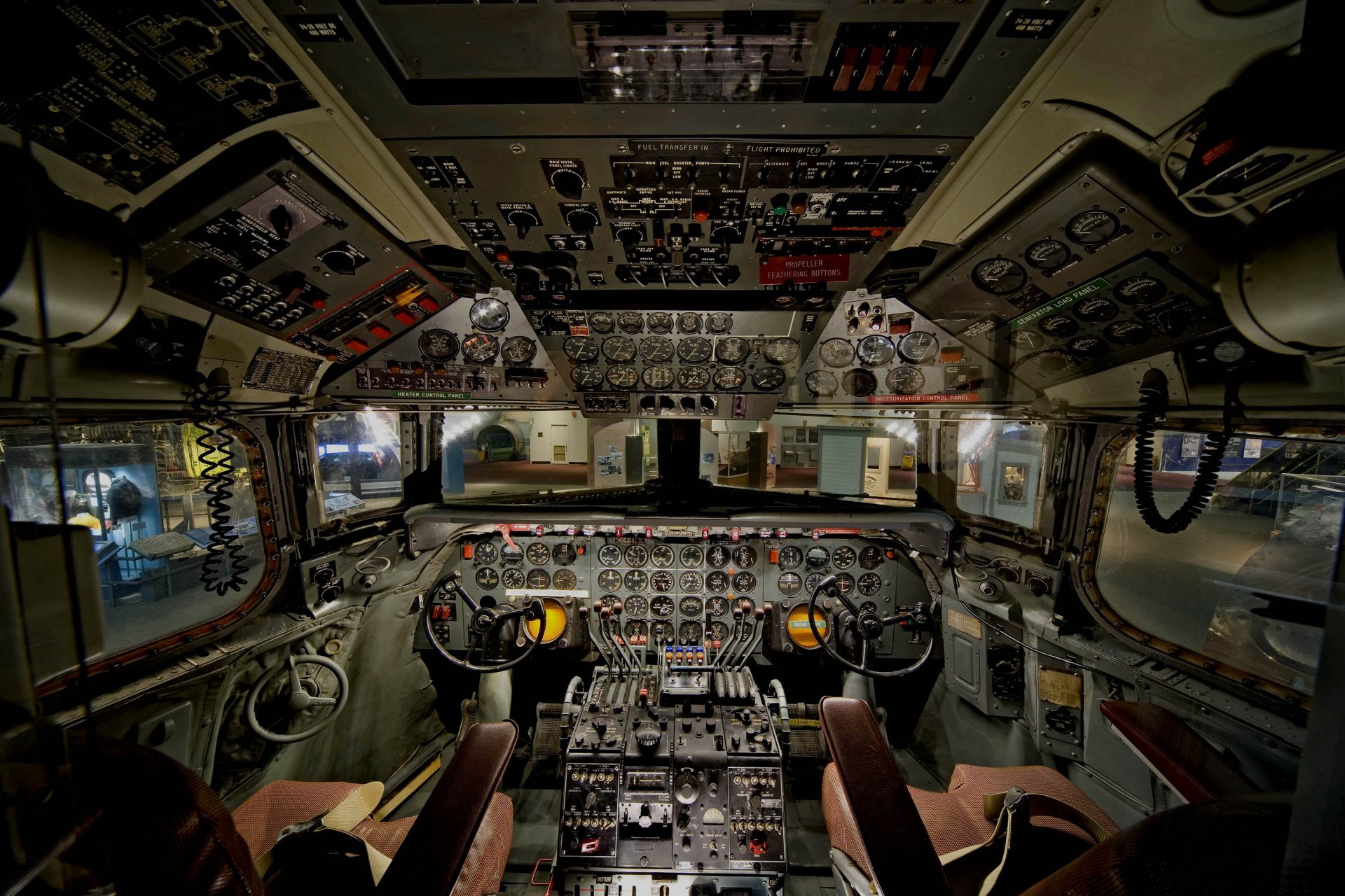
New Consumer applications have taken the human centric design and simplified UX to such a great height that its influence on Enterprise application is inevitable. But are Consumer applications and Enterprise applications comparable in terms of its users and complexities? When I see enterprise applications (like SAP, Oracle, even Salesforce), I see this
Now in the name of simplicity, it will be foolish to expect this in cockpit (within budget)
Consumer Applications and Enterprise applications are different. A simplified and minimalistic App design may score high in Learnability ad Delightful but will be Useless and Ineffective for most of the advanced users. This is "TRAP OF SIMPLICITY".
There is also no second opinion that enterprise Apps are less human centric and look drab in the name of "Complexity" and "Flexibility". That is "EXCUSE OF COMPLEXITY". The scope of improvement in Enterprise App UX is humongous but may lie in different direction.
Coming back to plane cockpit, it has also gone through design changes to minimize human errors and to guardrail in operations. One such example: In 1980s, there were many plane accidents because of "Human error"; pilots were dropping flap instead of wheels while landing switches were identical and placed next to each other. Then it was decided to give visual mapping to these switches by making physical changes as below: Landing gear should look like wheel where as flap gear like flaps.


Comments
Post a Comment